Graph
- Current value
- Multiple objects
- Context menu
- Series inspector
- Display modes
- Legend
- Value scale
- Time scale
- Cursors
- Limits
- Switching to summary
- Printing and export
The graph view displays historical data against time. The horizontal axis represents time, the vertical axis represents values, and the main area shows a trend line built from incoming samples. Invalid values are rendered with a dashed segment that starts at the corresponding point.
Current value
The legend shows the current value, source timestamp, and historical data load percentage. When the time cursor is active, the legend shows the value at the cursor position instead of the latest value.
Multiple objects
When several signals are added to one graph window, the client creates separate graph areas with their own value scales.
To inspect the same object in tabular form, open
Data from the command panel
or from the graph context menu.
Context menu
Right-clicking the graph area opens a context menu with commands to:
- show or hide the legend
- show or hide point markers
- switch between stepped and linear rendering
- show or hide the horizontal scrollbar
- change the line color
- change the graph background color
- jump to the current time and re-enable auto-scrolling
- add a new sub-graph area
- remove the selected sub-graph area
Series inspector
Selecting a trend line fills the inspector: a “Series” section appears below the element card, carrying the colour palette and the line’s current display modes — “Own pane”, “Show dots” and “Stepped”. The colour is set by clicking a palette swatch; the display modes are shown there but toggled from the graph’s context menu, described above.
Display modes
Stepped mode is enabled by default because it better reflects discrete signal changes. In this mode the trend is drawn as horizontal and vertical steps instead of direct point-to-point segments.
Point markers are also enabled by default to make sample timing easier to inspect. Each stored sample is rendered with a visible marker on the trend line.
Legend
The legend is shown inside the graph area by default. It displays one row for each plotted object and provides these columns:
- Name: object name
- Value: current value, or the value at the active cursor position
- Time: source timestamp
- Load: percentage of historical data already loaded from the Server
The legend can be hidden or restored from the context menu.
Value scale
The vertical scale boundaries are taken from the object scale defined in its configuration.
Time scale
The visible time range is controlled by the user.
To scroll through history, press and hold the left mouse button in the graph area and drag left or right. Scrolling to the right is limited by the current time. Older data is requested from the Server automatically as new historical ranges become visible.
The time interval can also be changed from the command panel by
selecting a period relative to the current time. To return to the latest
data and resume automatic scrolling as new values arrive, use the
Current time command from the graph context menu.
To zoom, drag on the corresponding scale:
- drag left or right on the time scale to change the time range
- drag up or down on the value scale to change the visible value range
The exact time boundaries can also be set using the Period toolbar
command.
To keep real-time rendering responsive, the number of simultaneously displayed points is limited to 10,000. If that limit would be exceeded, the visible time boundaries are adjusted automatically. Over a long period the graph may therefore not show the whole chosen range; for reports over a month or longer, use the summary.
Cursors
Clicking once on the time scale or value scale adds a cursor at the selected position. A cursor is a guide line that spans the full graph area:
- a vertical cursor is attached to a time value
- a horizontal cursor is attached to a value level
The scale shows a labeled cursor handle with the value to which the cursor is attached.
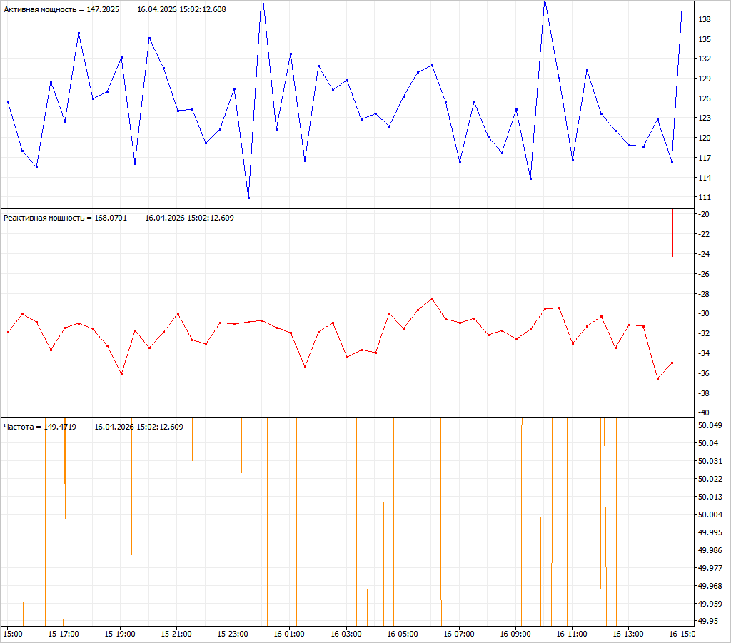
After a cursor is created, it follows the mouse pointer until it is placed with another click. The legend then shows graph values at the cursor position instead of the latest sample values.
Any number of cursors can be added. They stay attached to their scale values even when the graph is zoomed.
To detach a cursor and make it movable again, click its handle. To
remove a detached cursor, press Delete.
Limits
If the object has configured limits, they are displayed on the graph as horizontal dashed lines. For analog values this can include all four alarm thresholds:
- low alarm
- low warning
- high warning
- high alarm
See Architecture: Limit checks for the underlying configuration behavior.
Switching to summary
To inspect aggregated data for the same object and period, switch from
the graph window to
Summary
using the command panel or the object context menu.
Printing and export
A graph cannot be printed or exported — the Print, Export to CSV and
Export to Excel commands are unavailable for a graph window. To keep the
values, open the Data or
Summary window from the graph
and print or export that.